Reading time: 13 minute(s) @ 200 WPM.
A note: if you are reading this on Rpubs, the links will only work is you Control Click.
Irish COVID 19 Intertactive Map
Aim
To create a map that tracks the spread of COVID 19 in Ireland as the pandemic progresses. It is meant as a public educational tool and data will be collected from various sources, such as those cited in the Wiki page on COVID 19 in Ireland, and also health statistics which the HSE have recentrly started to publish on a county by county level.
The code was inspired by Dr. Richard Lent’s notebook on how to create interactive maps in R.
The book Geocomputation with R is a very useful resource. Excellent to get you started creating maps in R. Covers all the spatial data processing that occurs here, reading in shapefiles, manipulating spatial data and adding ancillary data that will be mapped to the spatial data files.
Most of the data handling carried out here uses the tidyverse syntax. The book R for Data Science by Hadley Wickham is the best reference source to get you started on using the tidyverse packages. I highly recommend the book.
Shapefiles
For manipulating geometry data see here
Using the sf package, standing for simple features. It’s a widely compatible spatial data format and can be used to read in and manipulate shapefiles.
I downloaded shapefiles for the Republic of Ireland from the Central Statistics Office, specifically the Census2011_Admin_Counties_generalised20m.zip. I unzipped to the project I am working at and stored it at this location: Shapefiles/Counties/ROI_Counties/. I downloaded the Northern Ireland county shapefile from the Northern Ireland Open Data Initiative. The shapefile can be found here
Creating all ireland shapefile.
library(dplyr)
library(tidyverse)
library(sf) #for reading in shapefiles
ROI_counties = st_read("Shapefiles/Counties/ROI_Counties/Census2011_Admin_Counties_generalised20m.shp")## Reading layer `Census2011_Admin_Counties_generalised20m' from data source `C:\Users\Cian\Documents\GitHub\Personal_Site\Personal_Site\content\Notebooks\Shapefiles\Counties\ROI_Counties\Census2011_Admin_Counties_generalised20m.shp' using driver `ESRI Shapefile'
## Simple feature collection with 34 features and 20 fields
## geometry type: MULTIPOLYGON
## dimension: XY
## bbox: xmin: 17491.14 ymin: 19589.93 xmax: 334558.6 ymax: 466919.3
## epsg (SRID): NA
## proj4string: +proj=tmerc +lat_0=53.5 +lon_0=-8 +k=1.000035 +x_0=200000 +y_0=250000 +datum=ire65 +units=m +no_defsNI_counties = st_read("Shapefiles/Counties/NI_Counties/OSNI_Open_Data_50K_Admin_Boundaries_–_Counties.shp")## Reading layer `OSNI_Open_Data_50K_Admin_Boundaries_–_Counties' from data source `C:\Users\Cian\Documents\GitHub\Personal_Site\Personal_Site\content\Notebooks\Shapefiles\Counties\NI_Counties\OSNI_Open_Data_50K_Admin_Boundaries_–_Counties.shp' using driver `ESRI Shapefile'
## Simple feature collection with 6 features and 2 fields
## geometry type: MULTIPOLYGON
## dimension: XY
## bbox: xmin: 188518.1 ymin: 309912.9 xmax: 366414.3 ymax: 453200.6
## epsg (SRID): NA
## proj4string: +proj=tmerc +lat_0=53.5 +lon_0=-8 +k=1.000035 +x_0=200000 +y_0=250000 +datum=ire65 +units=m +no_defsROI_counties <- select(ROI_counties, c(Nation = NUTS1NAME, County = COUNTYNAME, pop = TOTAL2011, ID = COUNTY))
NI <- NI_counties %>%
mutate(Nation = "Northern Ireland", Province = "Ulster",
pop = c(618108, 174792, 531665, 61170, 247132, 179000),
Full_County = c("Antrim", "Armagh", "Down", "Fermanagh", "Derry", "Tyrone"),
County_ID =c(27:32)) %>%
select(Nation, Full_County, County_ID, Province, pop)
county <- c("Carlow", "Dublin", "Dublin", "Dublin", "Dublin", "Kildare", "Kilkenny", "Laois", "Longford", "Louth", "Meath", "Offaly", "Westmeath", "Wexford", "Wicklow", "Clare", "Cork", "Cork",
"Kerry", "Limerick", "Limerick", "Tipperary", "Tipperary", "Waterford", "Waterford", "Galway", "Galway", "Leitrum", "Mayo", "Roscommon", "Sligo", "Cavan", "Donegal", "Monaghan")
provinces <- c(rep("Leinster",times = 15), rep("Munster", times = 10),
rep("Connacht", times =6), rep("Ulster", times =3))
County_ID <- c(1, rep(2, times=4), 3:13, rep(14,times=2), 15, rep(16, times=2), rep(17, times=2), rep(18,times=2), rep(19, times=2), 20:26)
ROI <- ROI_counties %>%
arrange(ID) %>%
mutate(Province = provinces, Full_County = county,
County_ID = County_ID) %>%
select(Nation, Full_County, County_ID, Province, pop)
Ireland <- rbind(ROI,NI)
Ireland$Full_County <- as.factor(Ireland$Full_County)
names(Ireland) <-c("Nation", "County", "County_ID", "Province", "pop", "geometry")
# Add fill and border layers to nz shapeCovid data
I am reading in the Covid data from dataset I created from the data released by the Department of Health website.
A note: I am creating multiple spatial datasets here using the group_by and summarise functions from dplyr. The sp package handles spatial data manipulation, and is compatible with dplyr. Each time I group_byand summarise I am creating a new dataset, with aggregated geometries. For example, here I group by county, province, nation and island, and can create plots at each level of grouping. For more on this see here
Reading in county, province and national data and joining to shapefiles so it can be mapped.
#reading in health data and tidying up
County_data <- as_tibble(read.csv("Data/County.csv")) %>%
  pivot_longer(cols = starts_with("x"), names_to = "Date",
               values_to = "Numbers") %>%
  mutate(Type = "Cases") %>%
  pivot_wider(names_from = Type, values_from = Numbers)

#install.packages("lubridate")#for manipulating dates and times
library(lubridate)

County_data$Date <- str_replace(County_data$Date, "^[A-Z]*", "") %>%
  dmy()

County_data$Cases <- as.numeric(str_replace(County_data$Cases, "<", ""))

#setting column names so that `County` column matches in Ireland_projected and County data to join
names(County_data) <- c("County", "Province", "Nation", "Date", "Cases")

#Grouping by County level in shapefile
County_Level = Ireland %>%
  group_by(County) %>%
  summarize(pop = sum(pop, na.rm = TRUE),
            Nation = first(Nation),
            Province = first(Province))

#joining data
County_stats <- left_join(County_Level,County_data)
County_stats <- County_stats %>%
  mutate(rate = Cases/pop)


#Province Data: grouping by province to and date to get province level data per date, summing over cases
Province_data = County_data %>%
  group_by(Province, Date) %>%
  summarize(Cases = sum(Cases, na.rm = TRUE))

#as ulster is split by nation, bringing in Northern Ireland data
#Loading Nation, to read in ulster values for Province data
Nation <- as_tibble(read.csv("Data/Nation.csv")) %>%
  pivot_longer(cols = starts_with("x"), names_to = "Date",
               values_to = "Numbers") %>%
  pivot_wider(names_from = Type, values_from = Numbers)

Nation$Date <- str_replace(Nation$Date, "^[A-Z]*", "") %>%
  dmy()

SixCounties <- filter(Nation, Nation == "Northern Ireland",
                      Date %in% unique(Province_data$Date))
#adding ulster data to province dataset
Province_data$Cases[Province_data$Province == "Ulster"] <- Province_data$Cases[Province_data$Province == "Ulster"] + SixCounties$Cases


#Grouping by Province Level shapefile
Province_Level = Ireland %>%
  group_by(Province) %>%
  summarize(pop = sum(pop, na.rm = TRUE))

#joining province COVID data to geometry data
Province_stats <- left_join(Province_Level, Province_data)
Province_stats <- Province_stats %>%
  mutate(rate = Cases/pop)


#National Data
#importing national level health data
Nation <- as_tibble(read.csv("Data/Nation.csv")) %>%
  pivot_longer(cols = starts_with("x"), names_to = "Date",
               values_to = "Numbers") %>%
  pivot_wider(names_from = Type, values_from = Numbers)

#editing date columns
Nation$Date <- str_replace(Nation$Date, "^[A-Z]*", "") %>%
  dmy()

#Grouping by Nation in shapefile and summing populations in each nation.
National_agg <- Ireland %>%
  group_by(Nation) %>%
  summarize(pop = sum(pop, na.rm = TRUE))

#joining province COVID data to geometry data
National_stats <- left_join(National_agg, Nation)
Using ggplot to make maps
ggplotis can plot maps using the geom_sf function. All the functionality of ggplot can be used. While static maps are created, these can be made interactive by using the plotlypackage - see here for the book on plotly.
It is also possible to animate ggplots using the gganimate package, creating a .gif that is a composite of many static map images. The Gapminder website uses this software to generate it’s amazing images. For more info see the gganimate webpage.
Here, I am just creating a static map of Ireland, with counties coloured by the number of COVID 19 cases.
library(ggplot2)

g1 = ggplot(County_stats) +
  geom_sf(aes(fill = Cases))

g1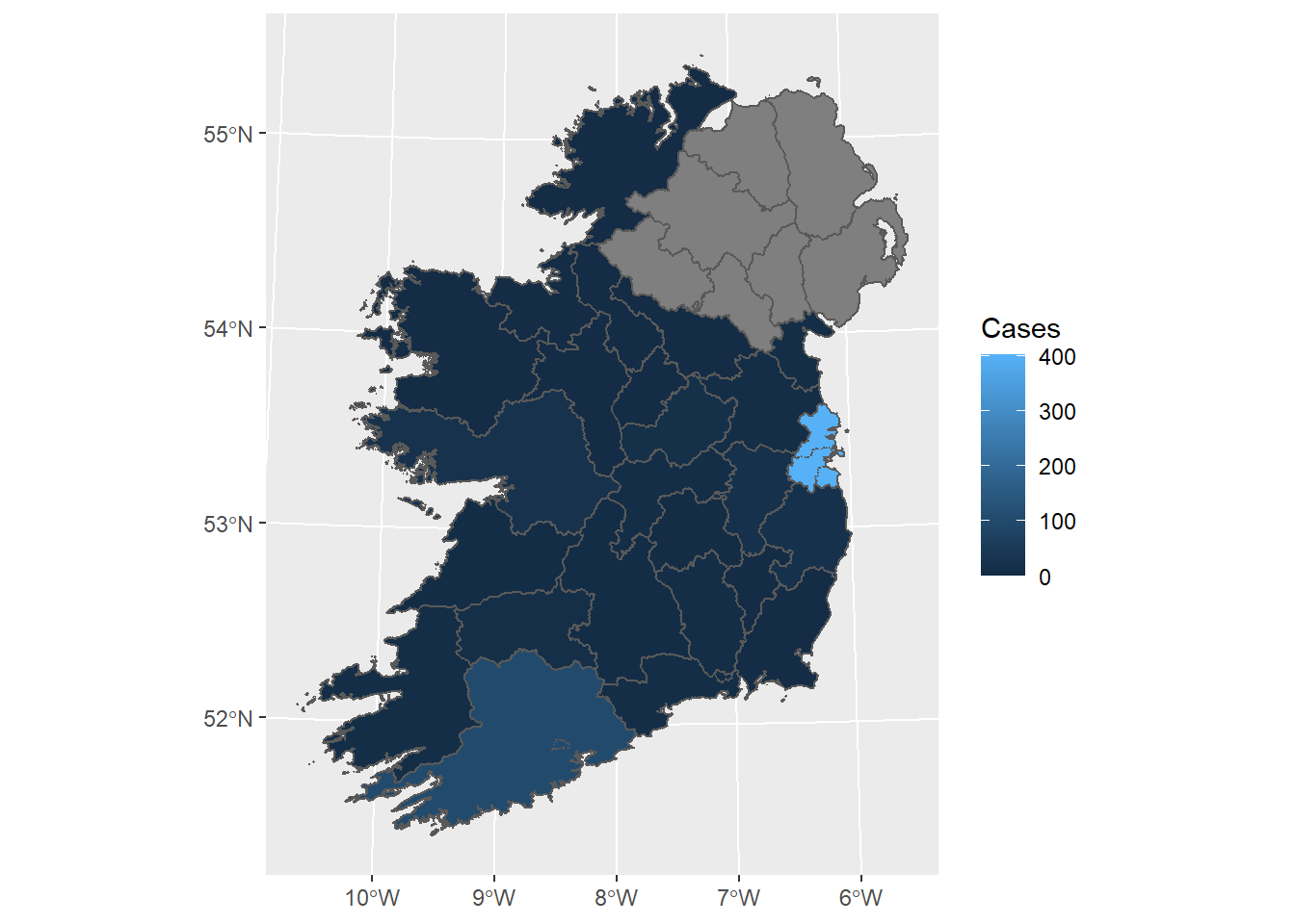
Creating Thematic Maps
The tmap package is a powerful and flexible map-making package with sensible defaults. It has a concise syntax that allows for the creation of attractive maps with minimal code which will be familiar to ggplot2 users. It also has the unique capability to generate static and interactive maps using the same code via tmap_mode().
For more see here.
library(tmap)
tmap_mode("plot")

Ireland %>%
  mutate(pop_100 = round(pop/1000)) %>%
tm_shape() +
  tm_fill(col = "pop_100",
          title = "Population (in 1000s)",
          text.size = 0.5,
          position = c("top", "left")) +
  tm_scale_bar(breaks = c(0, 50, 100), text.size = 0.5,
               position = c("right", "bottom")) +
  tm_layout(frame = FALSE)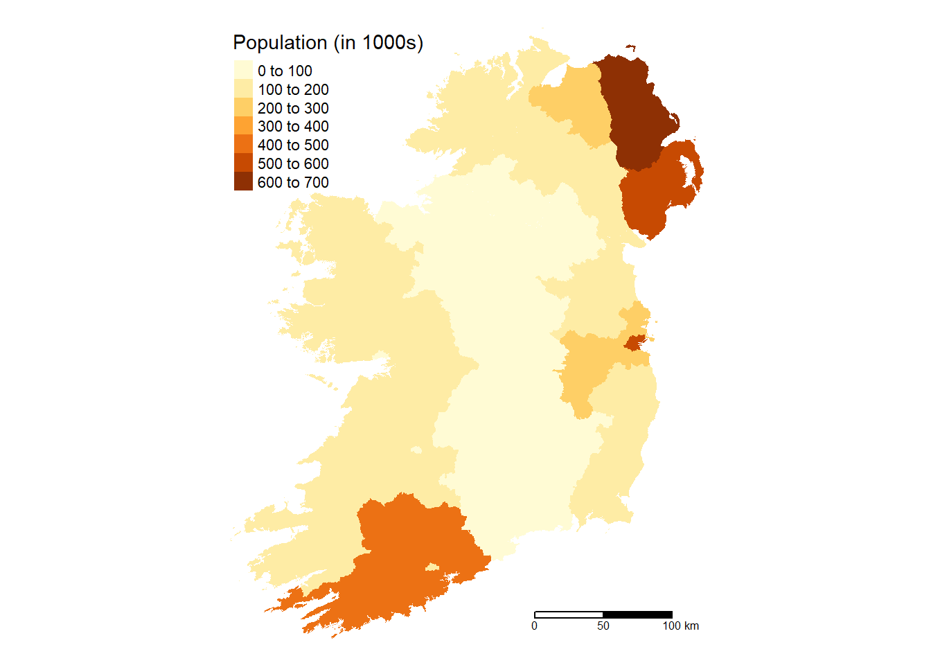
# County Map
 Ireland %>%
  group_by(County) %>%
  summarize(pop = sum(pop, na.rm = TRUE)) %>%
  tm_shape() +
  tm_fill(col = "pop",
          aplha = 0.5,
          title = "Population (in 1000s)",
          text.size = 0.5,
          position = c("top", "left")) +
  tm_scale_bar(breaks = c(0, 50, 100), text.size = 0.5,
               position = c("right", "bottom")) +
  tm_layout(frame = FALSE)
# Province Map
 Ireland %>%
  group_by(Province) %>%
  summarize(pop = sum(pop, na.rm = TRUE)) %>%
  tm_shape() +
  tm_fill(col = "pop",
          aplha = 0.5,
          title = "Population (in 1000s)",
          text.size = 0.5,
          position = c("top", "left")) +
  tm_scale_bar(breaks = c(0, 50, 100), text.size = 0.5,
               position = c("right", "bottom")) +
  tm_layout(frame = FALSE)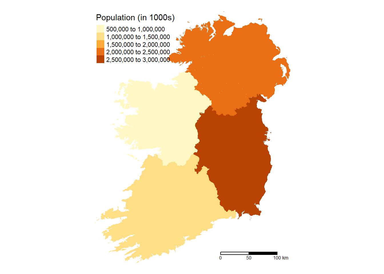
# Nation Map
  Ireland %>%
  group_by(Nation) %>%
  summarize(pop = sum(pop, na.rm = TRUE)) %>%
  tm_shape() +
  tm_fill(col = "pop",
          aplha = 0.5,
          title = "Population (in 1000s)",
          text.size = 0.5,
          position = c("top", "left")) +
  tm_scale_bar(breaks = c(0, 50, 100), text.size = 0.5,
               position = c("right", "bottom")) +
  tm_layout(frame = FALSE)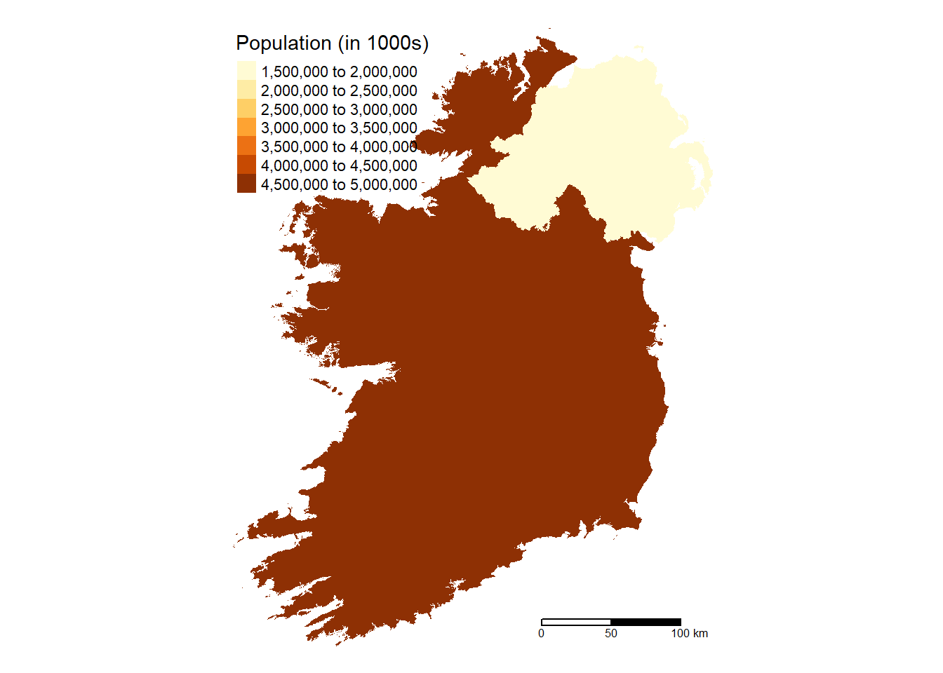
tmap_mode("view")

  Ireland %>%
  mutate(pop_100 = round(pop/1000)) %>%
tm_shape() +
  tm_fill(col = "pop_100",
          title = "Population (in 1000s)",
          text.size = 0.5,
          position = c("top", "left")) +
  tm_scale_bar(breaks = c(0, 50, 100), text.size = 0.5,
               position = c("right", "bottom")) +
tm_layout(frame = FALSE)100 to 200
200 to 300
300 to 400
400 to 500
500 to 600
600 to 700
Animated Maps
Just like gganimate, it is possible to make .gif files using the tmap package and another package called magick.
An example of a .gif created this way can be found here.
You will need to download Image Magick from here.
During installation you must check yes to downloading the converter function. Be careful to do so or the process won’t work.
Finally, you need to include the Image Magick application in your PATH. The code Sys.setenv(PATH = paste("C:\\Program Files\\ImageMagick-7.0.10-Q16", Sys.getenv("PATH"), sep=";")) adds Image Magick to the PATH, but you will need to check where Image Magick is stored on your computer and add the file address, replacing C:\\Program Files\\ImageMagick-7.0.10-Q16. On a windows system make sure to include two back slashes, rather than one, in the address.
#creating an animated Gif using tmap and magick packages
library(magick)

Nation_anim = tm_shape(National_stats) +
    tm_fill(col = "Cases",
          aplha = 0.5,
          title = "Cases",
          text.size = 0.5,
          position = c("top", "left")) +
  tm_scale_bar(breaks = c(0, 50, 100), text.size = 0.5,
               position = c("right", "bottom")) +
  tm_layout(frame = FALSE) +
  tm_facets(along = "Date", free.coords = FALSE)

#adding image magick to file path.
Sys.setenv(PATH = paste("C:\\Program Files\\ImageMagick-7.0.10-Q16", Sys.getenv("PATH"), sep=";"))
#tmap::tmap_animation(tm =Nation_anim, filename = "Nation_anim.gif", delay = 25, width = 1200, height = 800)
magick::image_read("Nation_anim.gif")
As you can see from above, a .gif is really just a series of static images shown at a certain interval. For some reason, the .gif isn’t loading into the markdown document, but you can see the gif at my github page.
Using Leaflet
Last but not least is leaflet. In the developers’ own words:
an open-source JavaScript library for mobile-friendly interactive maps
It’s used by the Washington Post, Facebook, Finanicial Times to create beautiful interactive maps that engage the public.
And it has an R package associated with it.
It is the most mature and widely used interactive mapping package in R. leaflet provides a relatively low-level interface to the Leaflet JavaScript library and many of its arguments can be understood by reading the documentation of the original JavaScript library (see leafletjs.com).
Leaflet maps are created with leaflet(), the result of which is a leaflet map object which can be piped to other leaflet functions. This allows multiple map layers and control settings to be added interactively
For more on leaflet in R see the GitHub page
Each leaflet map is a widget, with each leafet widget adding about 10MB to a file, so slowing down loading times. I’m only going to show one leaflet widget here, to illustrate what kind of features can be added, such as layers and groups. For simpler maps see my github repo
Adding layers to a map using groups
library(RColorBrewer) # for colour palettes
library(leaflet) #for interactive maps
library(scales) # for labels, placing commas in large numbers.
##
## Attaching package: 'scales'## The following object is masked from 'package:purrr':
##
## discard## The following object is masked from 'package:readr':
##
## col_factorlibrary(widgetframe) # for saving widgets to html documents## Loading required package: htmlwidgets#run tranformation when first running chunk
Province_stats = st_transform(Province_stats, 4326)
##setting up labels
Province_labels = vector()
#for loop to create labels
for(i in seq_along(unique(Province_stats$Province))){
for(e in seq_along(unique(Province_stats$Date))){
label <- paste0("<strong>",
Province_stats$Province[Province_stats$Date ==
unique(Province_stats$Date)[e] &
Province_stats$Province ==
unique(Province_stats$Province)[i]],
"</strong>", "<br>", "Cases: ",
Province_stats$Cases[Province_stats$Date ==
unique(Province_stats$Date)[e] &
Province_stats$Province ==
unique(Province_stats$Province)[i]])
Province_labels[[length(Province_labels)+1]] = label
}}
#subsetting labels for by date so I can plot each date as a layer
#using seq() funciton combined with nth() function to pick out each labels for each date.
#Attempting to automate for when ever a new date is added using for loop
Province_labs <- vector()
for (i in seq_along(unique(Province_stats$Date))){
labs <- Province_labels[seq(nth(seq_along(unique(Province_stats$Date)),i),last(seq_along(Province_stats$Date)), by = length(unique(Province_stats$Date)))]
Province_labs <- rbind(Province_labs,labs)
}
#now province_labs contains labels for each dates for all provinces in a row, so can access using square bracket and the order of the unique date.
Province_labs[2,]## [1] "<strong>Connacht</strong><br>Cases: 41"
## [2] "<strong>Leinster</strong><br>Cases: 426"
## [3] "<strong>Munster</strong><br>Cases: 131"
## [4] "<strong>Ulster</strong><br>Cases: 87"unique_date <- unique(Province_stats$Date)
provcirlelabel <- paste0("<strong>","Infection Rate: ","</strong>",
round(Province_stats$rate[
Province_stats$Date ==
last(unique(Province_stats$Date))],5))
# getting centroids for each county for plotting the circles
province_centroid = st_centroid(Province_stats[Province_stats$Date == last(unique(Province_stats$Date)),])
#extracting the longitude and latitude of the centroids to centre the circles at.
provlng <- vector("double", length(unique(Province_stats$Province))*length(unique(Province_stats$Date)))
provlat <- vector("double", length(unique(Province_stats$Province))*length(unique(Province_stats$Date)))
for (i in seq_along(province_centroid$geometry)){
provlng[i] <- c(province_centroid$geometry[[i]][1])
provlat[i] <- c(province_centroid$geometry[[i]][2])
}
#colour palettes
#palette for circles
provpalrate <- colorNumeric(
palette = "Purples",
domain = c(0:max(Province_stats$rate)))
#palette for polygons
provpalcases <- colorNumeric(
palette = "Reds",
domain = c(0:max(Province_stats$Cases)))
#highlight options for when hovering over with mouse
highlight <- highlightOptions(color = "grey",weight = 2,bringToFront =TRUE)
#setting label options
labeloptions <- labelOptions(style = list("font-weight" = "normal",
padding = "3px 8px"),
textsize = "15px",
direction = "auto")
# getting centroids for each county for plotting the circles
names(National_stats) <- c("Nation", "pop", "geometry", "Island", "Date", "Cases", "Death", "Recovered")
# getting centroids of island of Ireland so can specify the map to always generate at those centroids
National_stats = st_transform(National_stats, 4326)
Island <- National_stats %>%
group_by(Nation, Date) %>%
summarise(pop=sum(pop, na.rm = TRUE),
Cases=sum(Cases, na.rm=TRUE),
Death=sum(Death, na.rm=TRUE),
Recovered=sum(Recovered, na.rm=TRUE))
Ireland_centroil = st_centroid(Island)
#extracting the longitude and latitude of the centroids to centre the circles at.
lng <- c(Ireland_centroil$geometry[[1]][1])
lat <- c(Ireland_centroil$geometry[[1]][2])
#creating map
Province_map <- leaflet() %>%
setView(lng = lng, lat = lat,zoom = 6) %>% #setting the view to island of ireland centroid.
addMapPane("background_map", zIndex = 410) %>% # Level 1: bottom
addMapPane("polygons", zIndex = 420) %>% # Level 2: middle
addMapPane("circles", zIndex = 430) %>% # Level 3: top
addProviderTiles(providers$Esri.WorldTopoMap,
options = pathOptions(pane = "background_map"))%>%
addPolygons(data = Province_stats
[Province_stats$Date == unique_date[3],],
fillColor = ~provpalcases(Cases),
fillOpacity = 0.7,
color = "#b2aeae", #boundary colour, need to use hex color codes.
weight = 0.5,
smoothFactor = 0.2,
label = lapply(Province_labs[3,] , htmltools::HTML),
labelOptions = labeloptions,
highlightOptions = highlight,
options = pathOptions(pane = "polygons"),
group = unique_date[3]) %>% #adding to group
addLegend(pal = provpalcases,
values = Province_stats$Cases[Province_stats$Date == unique_date[3]],
position = "topright",
title = "Number of Cases<br>",
group = "county") %>%
addPolygons(data = Province_stats
[Province_stats$Date == unique_date[1],],
fillColor = ~provpalcases(Cases),
color = "#b2aeae", # Need to use hex color codes.
fillOpacity = 0.7,
weight = 0.5,
smoothFactor = 0.2,
label = lapply(Province_labs[1,],
htmltools::HTML),
labelOptions = labeloptions,
highlightOptions = highlight,
options = pathOptions(pane = "polygons"),
group = unique_date[1]) %>% #adding to group
addPolygons(data = Province_stats
[Province_stats$Date == unique_date[2],],
fillColor = ~provpalcases(Cases),
color = "#b2aeae", # Need to use hex color codes.
fillOpacity = 0.7,
weight = 0.5,
smoothFactor = 0.2,
label = lapply(Province_labs[2,], htmltools::HTML),
labelOptions = labeloptions,
highlightOptions = highlight,
options = pathOptions(pane = "polygons"),
group = unique_date[2]) %>% #adding to group
addCircles(data = Province_stats[Province_stats$Date == unique_date[3],],
lng = provlng,
lat = provlat,
fillColor = ~provpalrate(rate),
fillOpacity = 0.5,
weight = 0.5,
color = "#FFFFFF",
radius = 100000000*(Province_stats$rate)
[Province_stats$Date == unique_date[3]],
label = lapply(provcirlelabel, htmltools::HTML),
labelOptions = labeloptions,
highlightOptions = highlight,
options = pathOptions(pane = "circles"),
group = "Rate") %>% #adding to group
addLegend(pal = provpalrate,
values = Province_stats$rate[Province_stats$Date == unique_date[3]],
position = "bottomleft",
title = "Infection Rate<br>",
group = "circles") %>%
addLayersControl(overlayGroups = c("Rate",
as.character(unique_date[1]),
as.character(unique_date[2]),
as.character(unique_date[3]))) #setting order of groups
frameableWidget(Province_map)saveWidget(Province_map, file= "C:/Users/Cian/Documents/GitHub/Personal_Site/Personal_Site/public/Notebooks/mapping_in_r/index.html")